I.Q. Test Data Analysis
This project is based on an initial curiosity that turned into a major hobby especially during years of my life when I was having many trials and difficult times. That hobby I'm referring to is participating in experimental high-range intelligence testing (fancy sounding name for puzzle solving). I wrote the script that is available for viewing below to process all the data I dilligently kept over the years.
This script does a lot of things and I'm not going to talk about all of them right now but above all it produces some interesting visualizations, included below, which I think tell a lot of the story. I will say that this interactive Power BI Dashboard also helps in understanding the data.
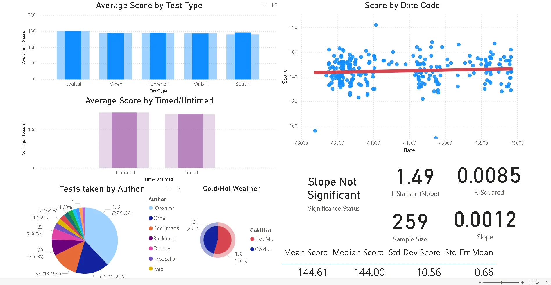
Here are some of my observations from it, for example. By clicking on the chart (like a section of the pie chart for example) and then holding the Ctrl button and clicking another element on another chart you can get different pictures of the subsets of the data (effectively filtering the data interactively).
This is what all of the tests except IQexams look like:
This is what mixed tests by Cooijmans looks like:
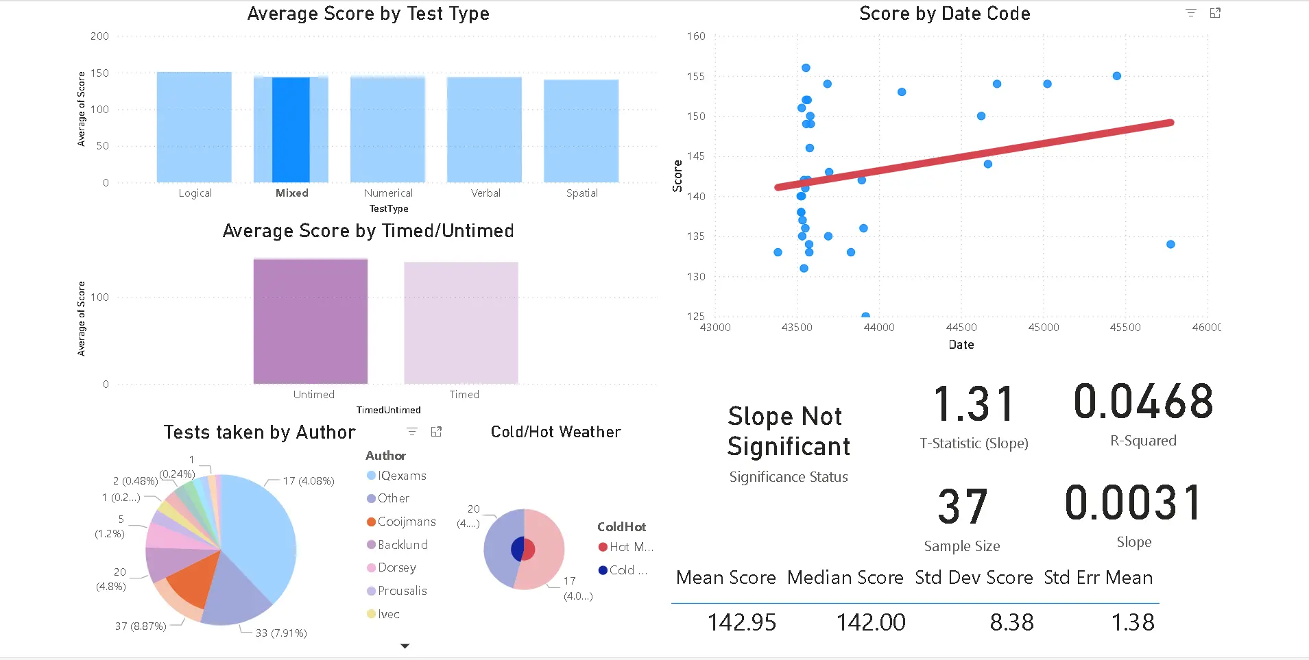
This is the combination of mixed and untimed tests (all authors):

From what I can tell (including some of my own deeper-dive analysis into date ranges, specifically, excluding the first eight date codes associated with test administrations) it seems that in the first 8 days or so I didn't really understand well the instructions and I was kind of "learning" how to take the tests during this phase. Strictly speaking I don't think this qualifies as a learning effect entirely, more of a gradual learning of the instructions and approaching a level playing field with the other test-takers on this now extinct platform IQexams.
Even when the data is filtered in such a way that the slope is significant, it is normally just a bit higher than 0.001 in magnitude and the coefficient of determination is very low also (the linear model is not predictive of anything really, other than some nonzero improvement from the beginning of my test taking).
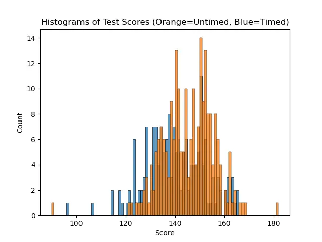
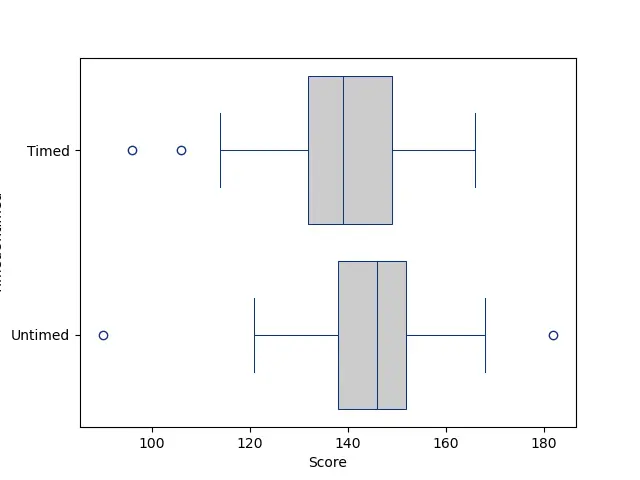
Histogram of timed/untimed scores superimposed on each other. You can see there is a slight offset in the positive direction with the untimed tests. I perform a bit better when I am not under time pressure, but still do exceptionally well with a time limit.
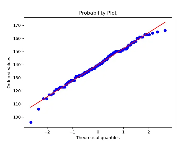
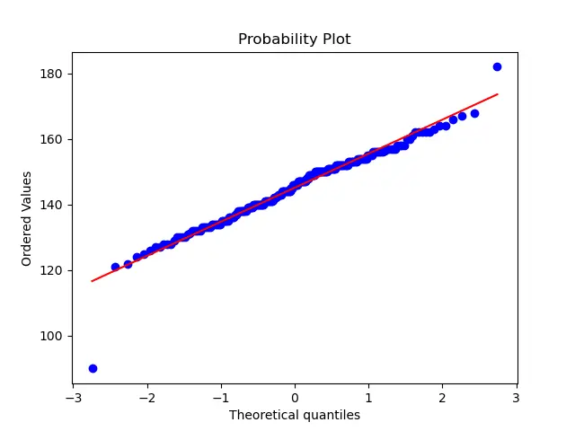
Probability plot of timed scores (very normal behavior)
Probability plot of untimed scores (very normal behavior)
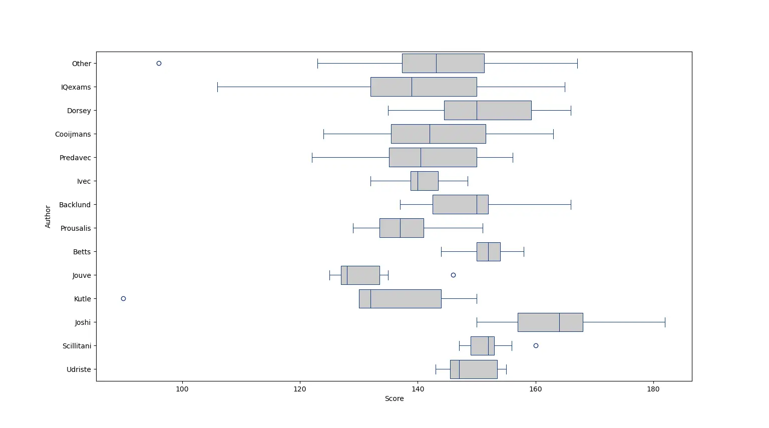
Boxplot of authors (visible are the ranges of scores for each author)
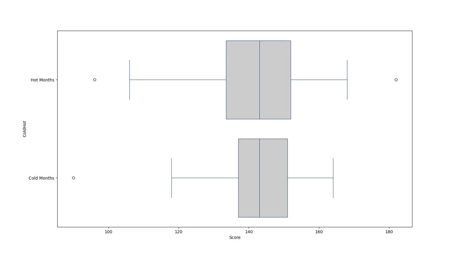
Boxplot of tests taken in hot months versus cold months (not much difference, but it seems a slightly wider range of performances in the hot months, perhaps from sometimes less motivation to perform well when there are people to see and places to go).
Boxplot of timed versus untimed tests (wider range - more randomness - and lower median with timed tests)
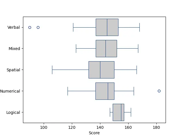
Boxplot of test types
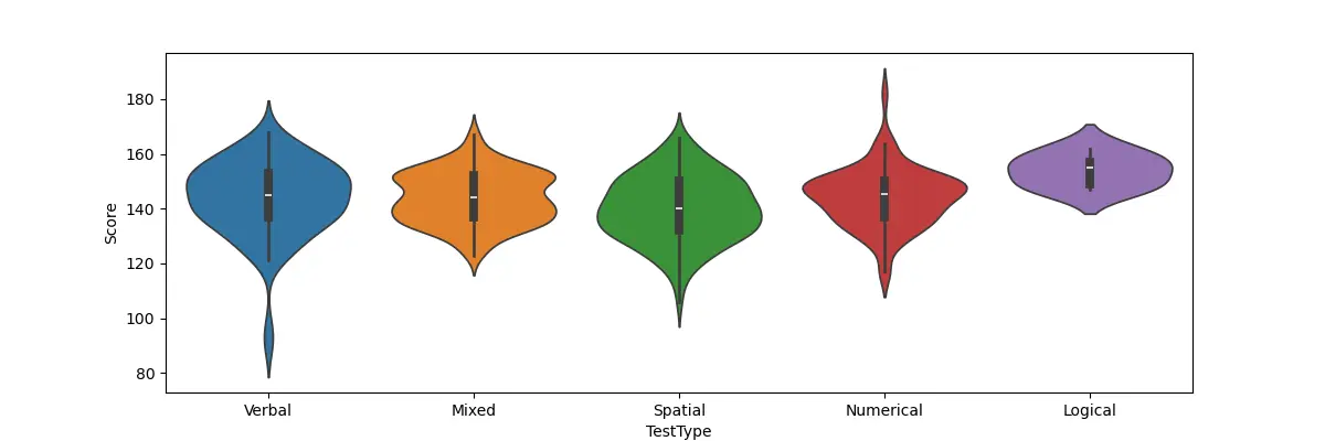
Violin plot of test types (you can see one of my very first tests there was a verbal test that I performed very low on compared to my normal scores). For some reason on logical tests I do a bit better than on other types of tests.
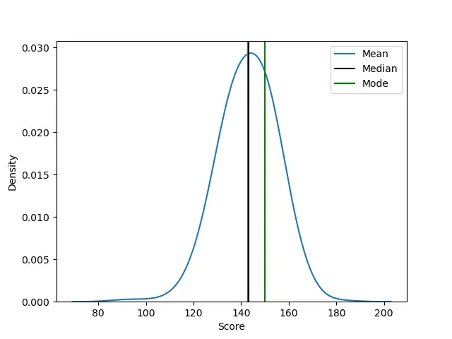
Bell curve of scores. The median and mean are almost the same, suggesting a symmetric distribution. The mode is shifted a bit over to the right.
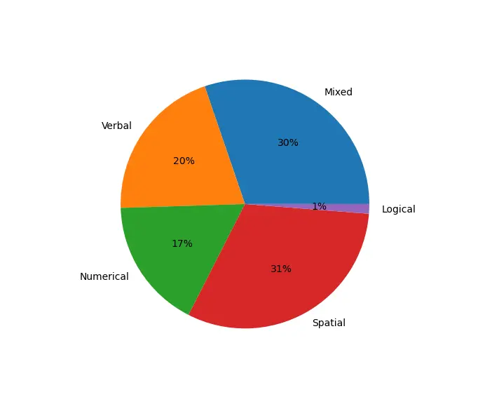
Pie chart of test types
Pie chart of authors. Thank God for all of the wonderful authors of these tests. All of them with a different personality, all of them basically measuring the same thing with all of their varied problems and problem types.

Scripts used for this analysis