Personal Health Data Analysis
This started with the question, "Am I in good health, and how do my personal health markers vary throughout the day, week, and month?" To start answering this (in addition to seeking medical advice from a trained and licensed doctor), I purchased an affordable smart watch and I created this code to analyze my personal health data from my MorePro AIR2 Fitness Tracker watch and my body composition scale and my regular scale. It is written in Python and it uses the read_csv method to load the data into a memory location called a DataFrame in pandas and then creates several visualizations based on some statistical calculations using numpy for some of the more advanced calculations and seaborn for the visualizations.
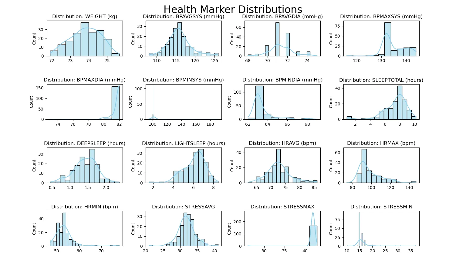
This is a plot of most of the variables I am tracking with histograms. Most of the variables are in healthy ranges, although weight is an area of potential improvement:

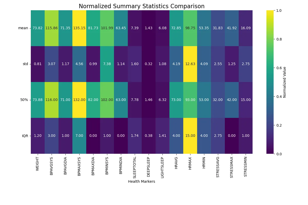
After this visual is closed, the next visual will be generated (the next line of code is executed in the Python script). The next step in solving my original problem is the following visualization. This visual is colored based on row, so each row has a highest value and a lowest value, with a color scale defined on the right which shows the highest and lowest values (yellow corresponding to high values, dark blue corresponding to low values). As can be seen, maximum heart rate (standard deviation and interquartile range) and maximum systolic blood pressure (mean and 50%) are the highest values. This makes it easy to see which variables vary the most and the least:

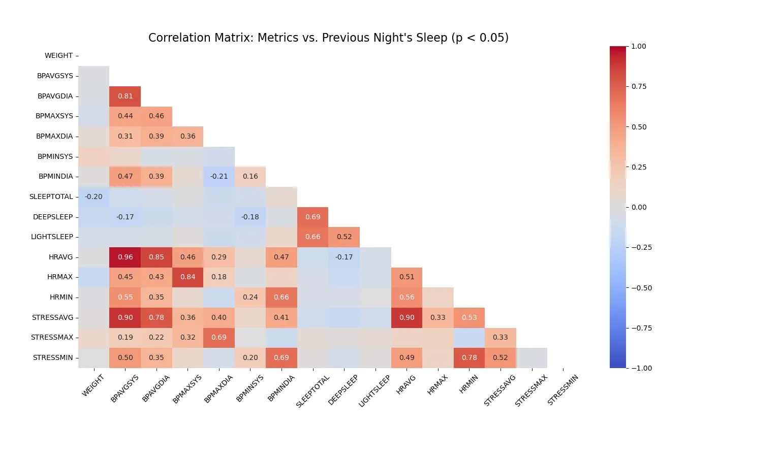
Then the following is produced. This is a correlation table. The darker the red color, the stronger the positive correlation. The darker the blue color, the stronger the negative correlation. As can be seen, there is a very strong positive correlation between heart rate, stress, and blood pressure. These are apparently very tightly linked physiological indicators. The colors are shown for all possible correlations in the table but the numbers are only included if they are statistically significant:

There are some interesting negative correlations that have arisen since the last time I ran this script that are significant, including one with total sleep and weight, and with deep sleep and blood pressure and also heart rate
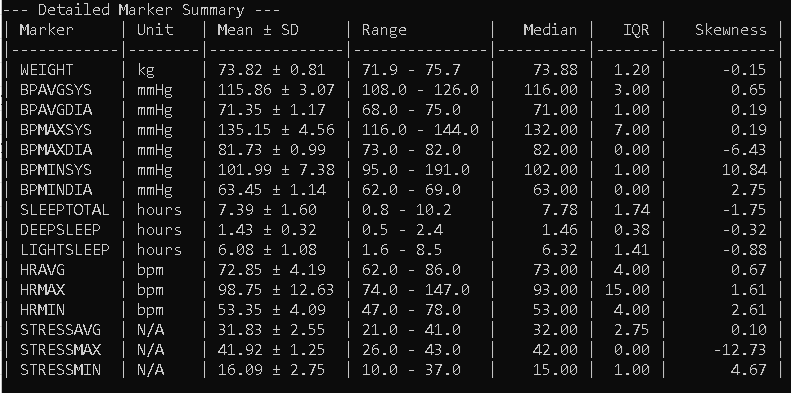
Lastly, a table is produced with ranges of the variables (this tells me how my health markers vary somewhat) and some other useful information. To get the variance throughout the day, actually looking at the data in the software application on my smart phone is necessary and predictable trends are manifest, stress rises when I wake up, reaches a peak, and decreases towards bed time. Blood pressure and heart rate share a similar pattern. If I get sick or have a night of poor sleep, stress, blood pressure, and heart rate tend to be higher:

Here is a link to a Power BI feature with my most recent health data: please click here to view. There are three pages. The blood pressure is likely a bit lower than represented here, since it is being measured in the wrist. Also, the sleep is likely a bit lower too, because of a systematic error that was discovered and subsequently overcorrected, slightly.
I went for simplicity in my correction by adding 1 hour to the total sleep and proportionally adjusting the deep and light sleep. This actually overcorrects the value slightly, leaving me with a graph suggesting I average over 8 hours per night, which is not accurate. I did this because of multiple factors that contribute to a value that is too low (i.e. it only starts measuring sleep at 9:30 PM, but I go to bed at 8 PM, sometimes it just fails to recognize I have been sleeping, also, I sometimes take naps outside of the sleep measurement window which are not registered). The conclusion from the data is that my blood pressure, sleep duration and quality, and stress levels are all very healthy, but my weight needs to be reduced a bit.
As can be seen, a simple CSV file can be read by the pandas library in Python and some statistical calculations can be made with the numpy library followed by visualizations prepared by the seaborn and matplotlib libraries. In the future I'd like to analyze the data from my body composition scale as I collect enough data (I only use it twice per month because the measurement doesn't change much day-to-day and the battery dies rapidly if regularly used). This project demonstrates the power of Python's data analysis libraries in transforming raw sensor data into actionable insights.
The code used for this analysis is available below if you're interested in viewing it:
Scripts used for this analysis